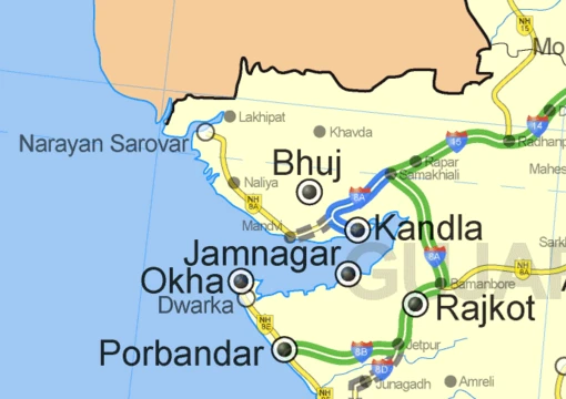
Choropleth map
Thematic map using color to show data by area.
Last updated

Belg4mit · Public domain
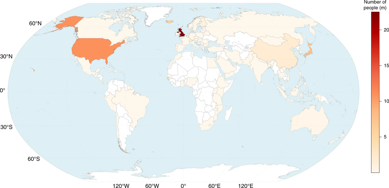
A choropleth map is a type of statistical thematic map that uses pseudocolor to represent an aggregate summary of a geographic characteristic within predefined spatial enumeration units, such as population density or per-capita income. It is likely the most common type of thematic map because published statistical data is generally aggregated into well-known geographic units, making them relatively easy to create using GIS, spreadsheets, or other software tools.
The earliest known example of such a map was created in 1826 by Baron Pierre Charles Dupin, depicting the availability of basic education in France by department. These early "cartes teintées" were soon used in France to visualize other "moral statistics" on education, disease, crime, and living conditions.
Their popularity grew with the increasing availability of demographic data from national censuses, notably a series of choropleth maps in the official reports of the 1841 Census of Ireland. After 1850, the advent of chromolithography allowed color to be added. The term "choropleth map" was introduced in 1938 by geographer John Kirtland Wright and was in common usage by the 1940s.
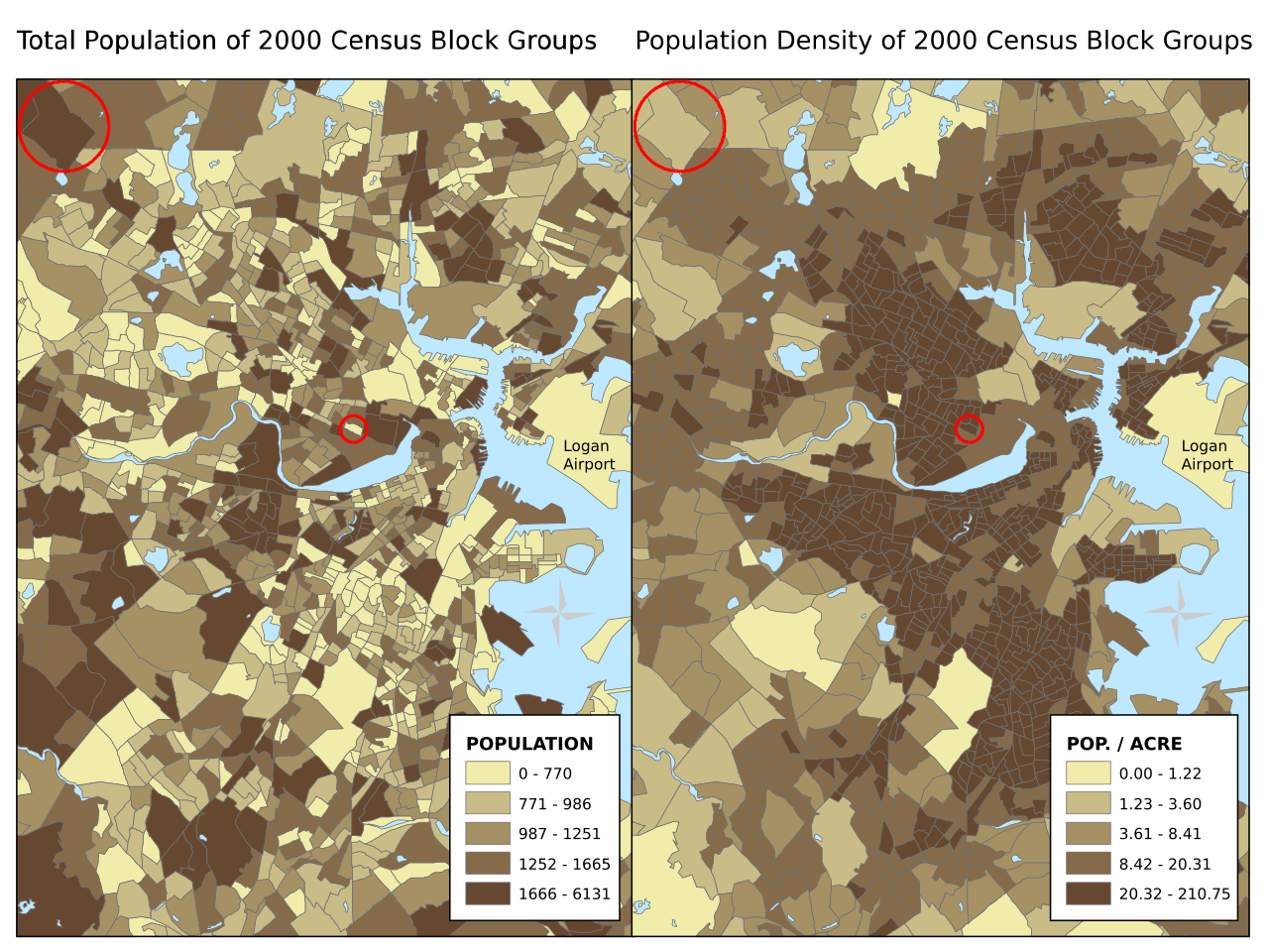
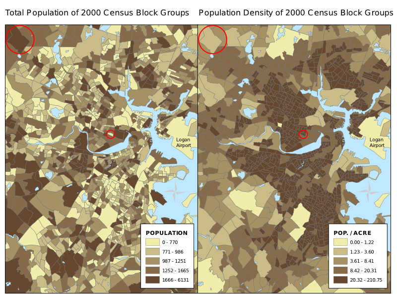
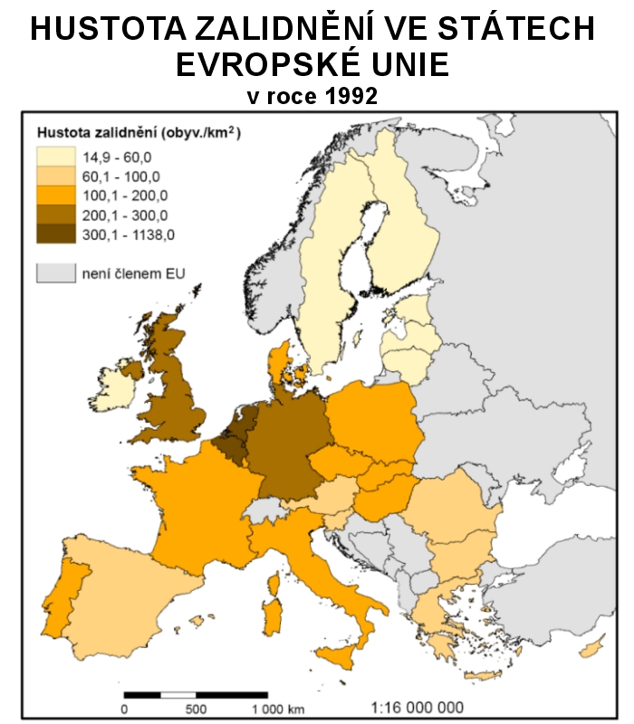
A choropleth map combines spatial data (a partition of geographic space into distinct districts) with statistical data aggregated within each district. The districts are usually pre-existing governmental or administrative units, such as counties or countries, whose boundaries may not align with the geographic distribution of the variable.
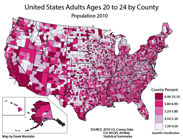
This can lead to issues like the ecological fallacy and the modifiable areal unit problem, as the constant color applied to each district masks internal variation. Using smaller districts can mitigate this but may result in overly complex maps. The choice of districts depends on the map's purpose and audience.
Quick Facts
- Creator
- Baron Pierre Charles Dupin
- Term coiner
- John Kirtland Wright
- Common usage by
- 1940s
- Type
- statistical thematic map
Facts from the source article.
Lore & Background
A choropleth map is a statistical thematic map that uses pseudocolor to represent an aggregate summary of a geographic characteristic within predefined spatial enumeration units, such as population density or per-capita income. It visualizes how a variable varies across a geographic area or shows the level of variability within a region. The districts are typically pre-existing governmental or administrative units—like countries, states, provinces, or counties—or units created for statistical aggregation, such as census tracts. Because these boundaries are not necessarily aligned with the actual geographic distribution of the variable, the map can mask internal variation, leading to potential misinterpretations like the ecological fallacy or the modifiable areal unit problem.
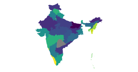
Using smaller districts can mitigate these issues by revealing finer variation, though it may also increase visual complexity. The earliest known example was created in 1826 by Baron Pierre Charles Dupin, depicting school enrollment in France by department. This spurred the production of more "cartes teintées" in France to visualize moral statistics on education, disease, crime, and living conditions. The term "choropleth map" was introduced in 1938 by geographer John Kirtland Wright and became common among cartographers by the 1940s.
Reader's Guide
Choropleth maps are significant because they provide an easy way to visualize how a variable varies across a geographic area or show the level of variability within a region. They bring together spatial data representing a partition of geographic space into distinct districts and statistical data representing a variable aggregated within each district.
However, using pre-defined aggregation regions can result in issues such as the ecological fallacy and the modifiable areal unit problem (MAUP), because the constant color applied to each district masks variation within it. The choice of regions ultimately depends on the map's intended audience and purpose. For many variables, an isarithmic or chorochromatic map may be preferred, but in many cases the choropleth map is the only feasible option due to data availability.
Also in the Codexery
More in Maps & Their Symbols
Sources
Compiled from Wikipedia and the sources listed below. Text from Wikipedia is available under CC BY-SA 4.0; this entry is adapted from it.
- Wikipedia: Choropleth map (CC BY-SA 4.0).
Spotted an error? Know more?
Reader corrections go straight into our review queue. Suggest an edit · How this site is sourced