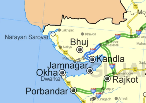
Proportional symbol map
Thematic map using symbol size to represent quantitative data.
Last updated
A proportional symbol map (or proportional point symbol map) is a type of thematic map that uses map symbols varying in size to represent a quantitative variable. Typically, the area of each symbol is mathematically proportional to the variable, though indirect methods such as categorizing symbols as 'small,' 'medium,' and 'large' are also used. This technique is generally applied to point symbols, distinguishing it from cartograms and flow maps, though gray areas exist between these types. For example, a Dorling cartogram replaces area polygons with proportional point symbols, often circles, while a linear cartogram distorts line lengths proportionally to a variable like travel time.
History
The technique has a rich history. Arthur H. Robinson credited Henry Drury Harness with the first clear attempt to portray point sizes proportionally, on an 1838 map of railroad traffic in Ireland that also showed city populations. The 1851 Census of Great Britain included maps by W. Bone with towns sized proportionally to population, featuring one of the first useful legends. Charles Joseph Minard later innovated by using proportional symbols to represent regions and by incorporating color and statistical charts within point symbols.
In the early 20th century, academic cartographers experimented with spheres proportional to volume and with transparency to resolve overlapping circles. A pivotal psychophysical study by James J. Flannery in 1956 applied Stevens's power law to map readers' underestimation of circle area, leading to the Flannery Scaling Adjustment still used today. Since the 1990s, most proportional symbol maps have been created using GIS and graphics software, and the rise of web mapping has enabled interactive versions on platforms like Esri ArcGIS Online and CARTO.
Point locations on these maps come from two sources: a point dataset with a single coordinate per feature (e.g., cities), or an aggregation district dataset where a point represents a predefined region. The variable chosen should be one where size is intuitively interpreted; Jacques Bertin noted that size is the visual variable most tied to a single interpretation, meaning a larger symbol clearly indicates more of something.
Quick Facts
- Field
- Cartography; Thematic mapping
- Known for
- Using symbol size to represent quantitative variables on maps
Facts from the source article.
Lore & Background
Proportional symbol maps use point symbols, most often circles, whose size varies to represent a quantitative variable, such as the population of a city. The area of each symbol is typically calculated to be mathematically proportional to the data value, though simpler methods like categorizing symbols as small, medium, or large are also used. While any geometric primitive (point, line, or region) can be resized, the term is generally reserved for point symbols; cartograms distort region size, and flow maps vary line width.
Gray areas exist, such as Dorling cartograms, which replace area polygons with proportional point symbols. The point locations on these maps come from two sources: a point dataset with a single coordinate for each feature (e.g., cities), or an aggregation district dataset where a point represents a predefined region containing summarized data. The most effective variables for this technique are those where size is intuitively interpreted; Jacques Bertin noted that size is the visual variable most closely tied to a single interpretation, as a larger symbol clearly indicates more of something.
The history of the technique began with Henry Drury Harness, who on an 1838 map of Irish railroad traffic used proportional widths to show city population. W. Bone later produced maps for the 1851 Census of Great Britain with towns sized proportionally to population, including one of the first useful legends. Charles Joseph Minard advanced the method by using proportional symbols to represent regions and by incorporating color and statistical charts within the symbols.
Reader's Guide
Proportional symbol maps are significant because they provide an intuitive way to represent quantitative variables spatially, with size being the visual variable most closely tied to a single interpretation: larger symbols represent more of something. The technique is complementary to choropleth maps, as it is best suited for spatially extensive variables (e.g., total population) that are problematic for choropleths. A key legacy is the Flannery Scaling Adjustment, derived from James J. Flannery’s psychophysical research in the 1950s, which found that map readers tend to underestimate circle area according to Stevens’s power law, leading to a predictable correction still applied today.
Historically, the method was pioneered by Henry Drury Harness in an 1838 map of Irish railroad traffic, which used proportional widths to show city populations. It was soon adopted for the 1851 British Census maps by W. Bone, who included one of the first useful legends. Charles Joseph Minard later innovated by using proportional symbols for regions and incorporating color and statistical charts within the symbols.
In the early twentieth century, cartographers experimented with volumetric spheres and transparent symbols to handle overlapping circles. Since the 1990s, almost all such maps have been created with GIS and graphics software, and the rise of web mapping after 2005 enabled interactive versions on cloud platforms. The variable chosen for symbol size is best when it is intuitively interpreted, as Jacques Bertin argued that size is the visual variable most directly tied to a single quantitative meaning.
Frequently Asked Questions
What is Proportional symbol map?
It is a thematic cartographic technique in which point symbols on a map are sized so their area corresponds to a quantitative variable at each location. Rather than shading regions or drawing arrows, it encodes data magnitude directly into the footprint of individual symbols.
How does Proportional symbol map actually work?
Each symbol's area is calculated to be mathematically proportional to the value it represents, so a location with double the data gets a symbol with double the area. Some practitioners simplify this into discrete tiers—small, medium, large—when exact scaling feels visually cluttered.
Also in the Codexery
More in Maps & Their Symbols
Sources
Compiled from Wikipedia and the sources listed below. Text from Wikipedia is available under CC BY-SA 4.0; this entry is adapted from it.
- Wikipedia: Proportional symbol map (CC BY-SA 4.0).
Spotted an error? Know more?
Reader corrections go straight into our review queue. Suggest an edit · How this site is sourced