Venn diagram
A diagram style showing logical relations between sets, popularized by John Venn.

ASpiegler · CC BY-SA 4.0
A Venn diagram is a widely used diagram style that shows the logical relation between sets, popularized by John Venn (1834–1923) in the 1880s. The diagrams are used to teach elementary set theory, and to illustrate simple set relationships in probability, logic, statistics, linguistics and computer science. A Venn diagram uses simple closed curves on a plane to represent sets. The curves are often circles or ellipses. Very similar ideas had been proposed before Venn such as by Christian Weise in 1712 (Nucleus Logicoe Wiesianoe) and Leonhard Euler in 1768 (Letters to a German Princess). The idea was popularised by Venn in Symbolic Logic, Chapter V "Diagrammatic Representation", published in 1881.
- Born
- 1834
- Died
- 1923
- Field
- Logic, Mathematics
- Nationality
- British
- Known for
- Popularizing Venn diagrams
Lore & Background
Venn diagrams were introduced in 1880 by John Venn in a paper entitled "On the Diagrammatic and Mechanical Representation of Propositions and Reasonings" in the Philosophical Magazine and Journal of Science. The use of these types of diagrams in formal logic, according to Frank Ruskey and Mark Weston, predates Venn but are "rightly associated" with him as he "comprehensively surveyed and formalized their usage, and was the first to generalize them". Diagrams of overlapping circles representing unions and intersections, such as Borromean rings, were already in frequent use in the Middle Ages. However, the extent to which these types of diagrams can be considered precursors to Venn diagrams is disputed. Euler diagrams, which are similar to Venn diagrams but do not necessarily contain all possible unions and intersections, were named after the mathematician Leonhard Euler in the 18th century. However, these diagrams, which are considered the precursors of Venn diagrams, can also be clearly traced back to the 16th century. Pioneers in this tradition of Euler diagrams included Erhard Weigel (1625–1699) and his students Johann Christoph Sturm (1635-1703) and Gottfried Wilhelm Leibniz (1646–1716). Christian Weise (1642–1708) is also worth mentioning, whose student Johann Christian Lange worked intensively on these diagrams. Euler further developed these diagrams, and Immanuel Kant (1724–1804) and his students popularized them in the 19th century. Venn did not use the term "Venn diagram" and referred to the concept as "Eulerian Circles". He became acquainted with Euler diagrams in 1862 and wrote that Venn diagrams did not occur to him "till much later", while attempting to adapt Euler diagrams to Boolean logic. In the opening sentence of his 1880 article Venn wrote that Euler diagrams were the only diagrammatic representation of logic to gain "any general acceptance". Venn viewed his diagrams as a pedagogical tool, analogous to verification of physical concepts through experiment. As an example of their applications, he noted that a three-set diagram could show the syllogism: 'All A is some B. No B is any C. Hence, no A is any C.' Charles L. Dodgson (Lewis Carroll) includes "Venn's Method of Diagrams" as well as "Euler's Method of Diagrams" in an "Appendix, Addressed to Teachers" of his book Symbolic Logic (4th edition published in 1896).
Reader's Guide
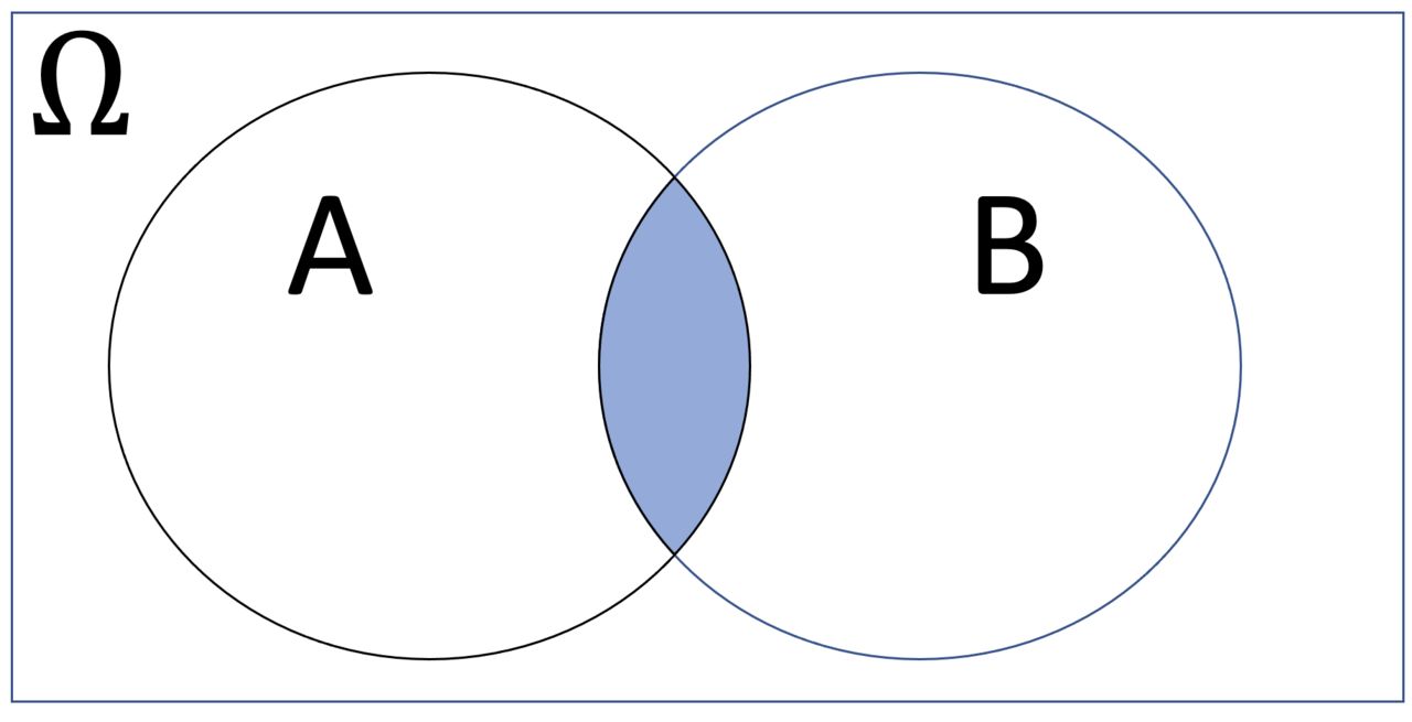
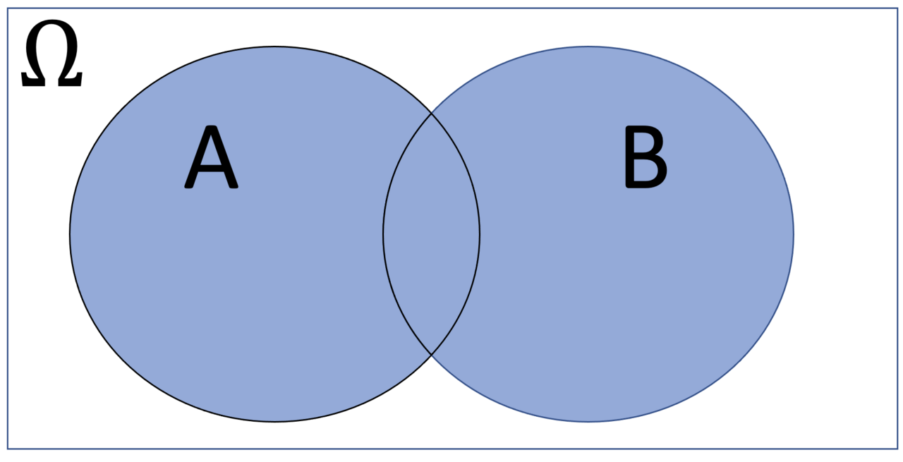
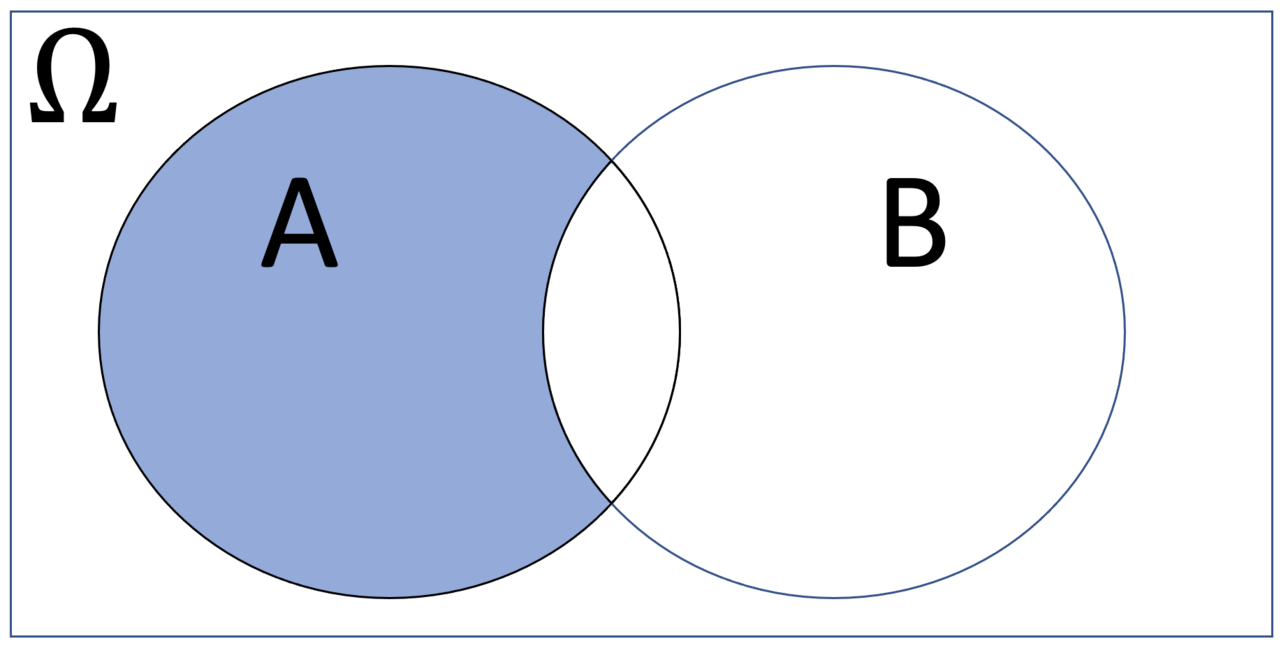
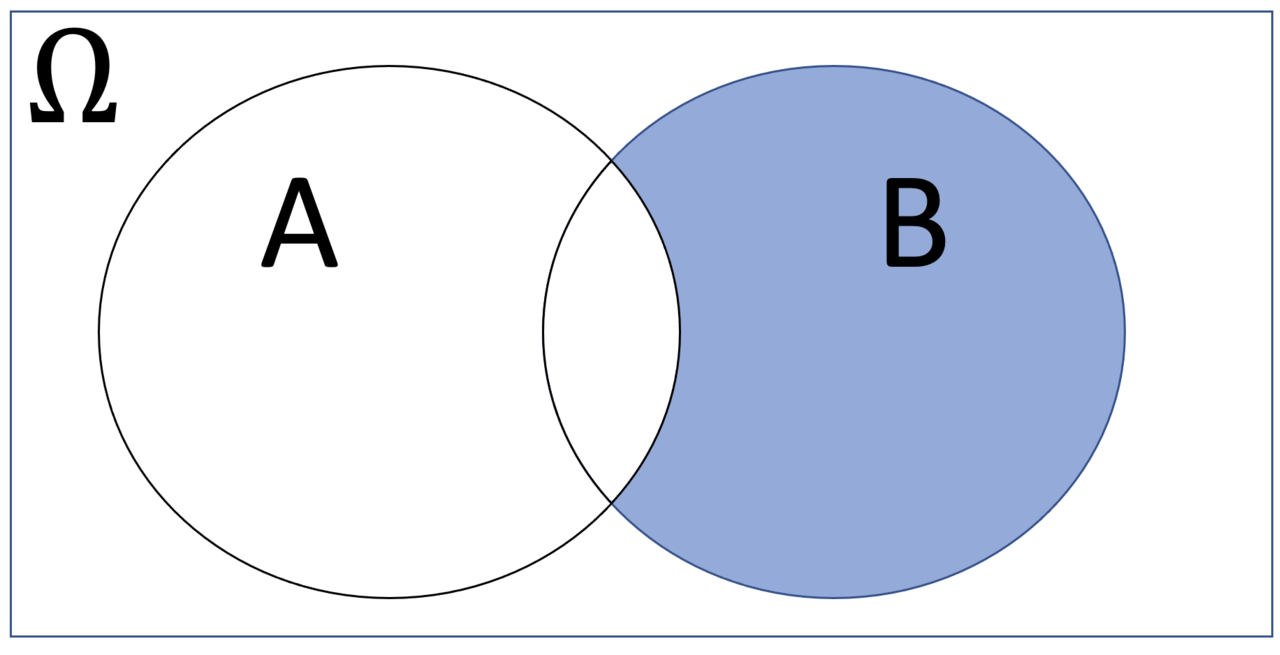
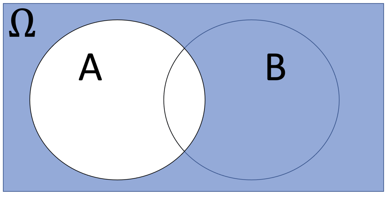
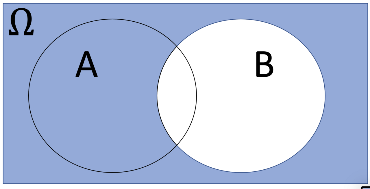
A Venn diagram is constructed with a collection of simple closed curves drawn in a plane. According to Lewis, the "principle of these diagrams is that classes [or sets] be represented by regions in such relation to one another that all the possible logical relations of these classes can be indicated in the same diagram. That is, the diagram initially leaves room for any possible relation of the classes, and the actual or given relation, can then be specified by indicating that some particular region is null or is not-null". Venn diagrams normally comprise overlapping circles. The interior of the circle symbolically represents the elements of the set, while the exterior represents elements that are not members of the set. For instance, in a two-set Venn diagram, the overlapping region represents the intersection of the two sets. A Venn diagram in which the area of each shape is proportional to the number of elements it contains is called an area-proportional (or scaled) Venn diagram.
Did You Know?
- Rotationally symmetric Venn diagrams exist if and only if n is a prime number.
- The term "Venn diagram" was first used by Clarence Irving Lewis in 1918.
A Visual Language for Relationships and Groupings
Venn diagrams occupy a place within the family of charts and graphs that constitute the visual toolkit of data and information visualization. Their particular strength lies in helping a target audience visually explore and discover structures, relationships, correlations, clusters, and unusual groupings within data—precisely the kinds of patterns that remain difficult to identify when information is locked in raw numerical form. By rendering set membership and overlap as intersecting shapes, a Venn diagram translates abstract, non-physical data into a schematic form that the eye can process at a glance. This aligns with the field's foundational assumption that visual representations and interaction techniques exploit the human eye's broad bandwidth pathway into the mind, allowing users to see, explore, and understand large amounts of information simultaneously. Whether the underlying data is quantitative or qualitative, the diagram's purpose is to add value to raw information, reinforce the viewer's cognition, and help derive insights that ultimately support sound decision-making.
Design Discipline and Cognitive Clarity
Effective use of a Venn diagram demands the same design rigor the broader visualization field prescribes: the underlying data must be accurate and current, the presentation simple and uncluttered, and every visual element—shape, color, label—chosen deliberately in a meaningful, non-distracting manner. Because the discipline is inherently interdisciplinary, drawing on descriptive statistics, visual communication, graphic design, cognitive science, and human-computer interaction, crafting a clear Venn diagram is simultaneously an art and a science. Supporting text should accompany the graphic so that verbal and graphical components complement one another, ensuring quick and memorable understanding. Ongoing research into how people read and misread different types of visualizations informs which structural features of a Venn diagram are most comprehensible. Poorly designed or intentionally misleading versions, however, can function as powerful instruments for disseminating misinformation and manipulating public perception, which is why data visualization literacy has become as essential as textual or mathematical literacy in the information age.
From Statistical Graphic to Narrative Tool
A Venn diagram can serve in two distinct communicative modes. In the statistical-graphics tradition, it operates as a compact graphical device used among researchers and analysts to perform exploratory data analysis or convey the results of such analyses, where visual appeal and storytelling are secondary to precision and clarity. In the narrative-visualization mode, the same overlapping-shapes structure is embedded within a structured story flow, blending data analysis, storytelling, and visualization to present information through a compelling, story-driven visual experience. In that context the diagram helps an audience identify trends, patterns, and relationships through a narrative arc rather than a bare statistic. Data scientists and analysts may first deploy it to check data quality, spot unusual gaps or missing values, and explore the structures and features of a dataset before pairing it with a narrative to convince a broader audience to make a decision or take a specific action.
Audience, Context, and Emerging Frontiers
The effectiveness of a Venn diagram depends heavily on awareness of the target audience's needs and expertise level. For a non-technical public it can convey a concise, engaging version of set-based information, functioning much like an infographic, while for domain experts and executives it supports decision-making, performance monitoring, idea generation, and research stimulation. The field from which it draws has emerged from research spanning human-computer interaction, computer science, graphics, visual design, psychology, photography, and business methods, and is increasingly applied in scientific research, digital libraries, data mining, financial analysis, market studies, manufacturing control, and drug discovery. Looking forward, emerging technologies such as virtual, augmented, and mixed reality hold the potential to make even a simple Venn-diagram concept more immersive, intuitive, interactive, and easily manipulable, thereby enhancing the user's visual perception and cognition well beyond what a static two-dimensional rendering can achieve.
Gallery
Frequently Asked Questions
Who is Venn diagram?
The Venn diagram is a diagrammatic method for illustrating logical relationships between sets, brought to wide attention by the British logician John Venn (1834–1923) in the 1880s. It is a visual tool rather than a person, and it became a cornerstone of set-theory education.
What are Venn diagram's powers/role?
Each set is drawn as a region inside a simple closed curve—usually a circle or ellipse—and the curves overlap in every possible combination to display all logical relations among the sets. Individual elements appear as points on the plane within those regions.
Why is Venn diagram important?
It offers an intuitive, at-a-glance picture of how sets intersect, overlap, or stay disjoint, removing the need for dense formal notation. That accessibility makes it especially powerful for teaching basic set theory and for communicating logic in probability, statistics, linguistics, and computer science.
Where did Venn diagram come from and who created it?
The diagram was popularized by John Venn, a British mathematician and logician born in 1834 and deceased in 1923, who formalized the overlapping-curve representation in the 1880s. While earlier thinkers had used similar ideas, Venn's version became the standard form taught and referenced worldwide.
More in Graphs And Data Visualization 1-24
Spotted an error? Know more?
Reader corrections go straight into our review queue. Suggest an edit · How this site is sourced