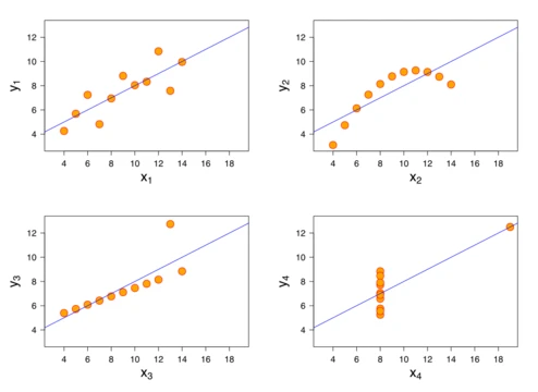
Scatter plot
A plot using Cartesian coordinates to display values for two variables, often used to reveal correlations.

RCraig09 · CC BY-SA 4.0
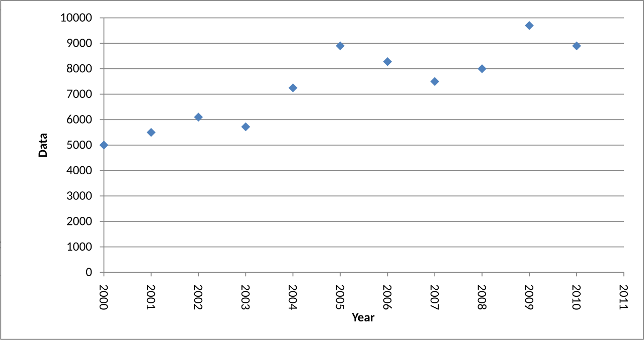
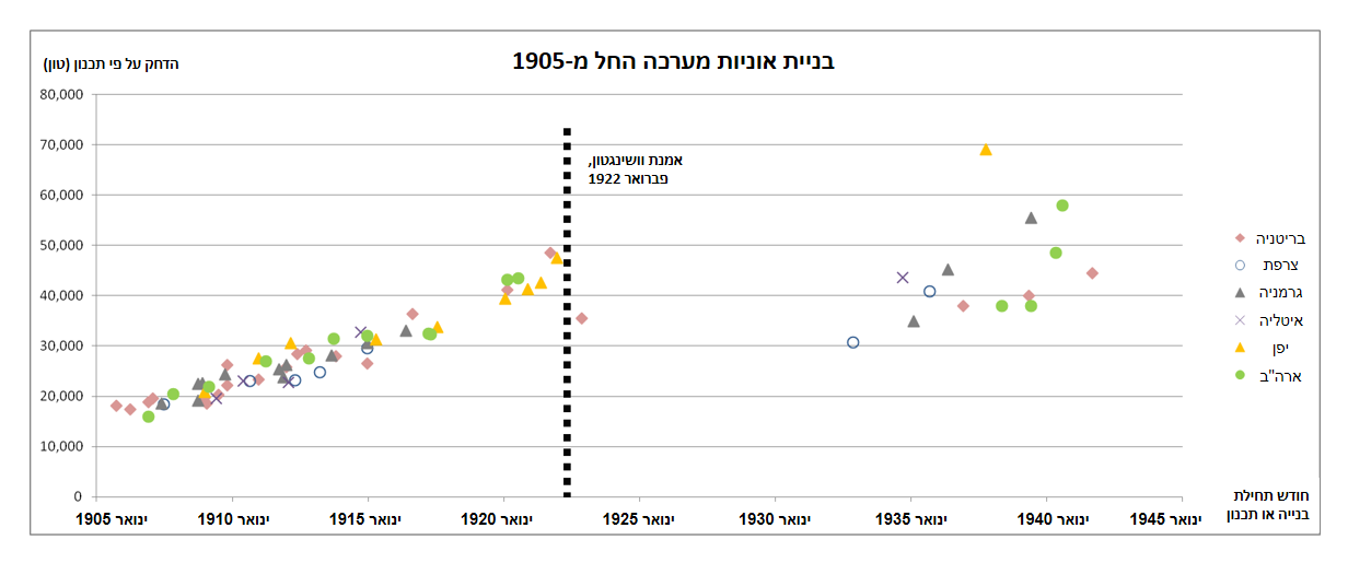
A scatter plot, also called a scatterplot, scatter graph, scatter chart, scattergram, or scatter diagram, is a type of plot or mathematical diagram using Cartesian coordinates to display values for typically two variables for a set of data. If the points are coded (color/shape/size), one additional variable can be displayed. The data are displayed as a collection of points, each having the value of one variable determining the position on the horizontal axis and the value of the other variable determining the position on the vertical axis. The scatter diagram is one of the seven basic tools of quality control.
- First attributed to
- John Herschel (1833)
Lore & Background
According to Michael Friendly and Daniel Denis, the defining characteristic distinguishing scatter plots from line charts is the representation of specific observations of bivariate data where one variable is plotted on the horizontal axis and the other on the vertical axis. The two variables are often abstracted from a physical representation like the spread of bullets on a target or a geographic or celestial projection. While Edmund Halley created a bivariate plot of temperature and pressure in 1686, he omitted the specific data points used to demonstrate the relationship. Friendly and Denis claim his visualization was different from an actual scatter plot. Friendly and Denis attribute the first scatter plot to John Herschel. In 1833, Herschel plotted the angle between the central star in the constellation Virgo and Gamma Virginis over time to find how the angle changes over time, not through calculation but with freehand drawing and human judgment. Sir Francis Galton extended and popularized the scatter plot and many other statistical tools to pursue a scientific basis for eugenics. When, in 1886, Galton published a scatter plot and correlation ellipse of the height of parents and children, he extended Herschel's mere plotting of data points by binning and averaging adjacent cells to create a smoother visualization. Karl Pearson, R. A. Fischer, and other statisticians and eugenicists built on Galton's work and formalized correlations and significance testing.
Reader's Guide
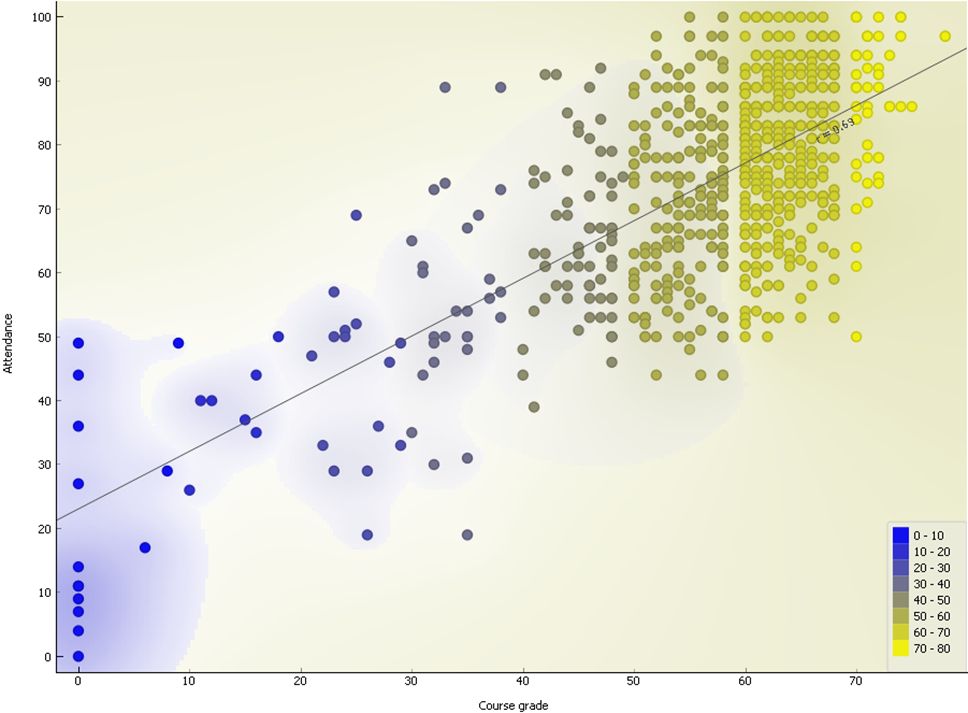
A scatter plot can be used either when one continuous variable is under the control of the experimenter and the other depends on it or when both continuous variables are independent. If a parameter exists that is systematically incremented and/or decremented by the other, it is called the control parameter or independent variable and is customarily plotted along the horizontal axis. The measured or dependent variable is customarily plotted along the vertical axis. If no dependent variable exists, either type of variable can be plotted on either axis and a scatter plot will illustrate only the degree of correlation (not causation) between two variables. A scatter plot can suggest various kinds of correlations between variables with a certain confidence interval. For example, weight and height would be on the -axis, and height would be on the -axis. Correlations may be positive (rising), negative (falling), or null (uncorrelated). If the dots' pattern slopes from lower left to upper right, it indicates a positive correlation between the variables being studied. If the pattern of dots slopes from upper left to lower right, it indicates a negative correlation. A line of best fit (alternatively called 'trendline') can be drawn to study the relationship between the variables. An equation for the correlation between the variables can be determined by established best-fit procedures. For a linear correlation, the best-fit procedure is known as linear regression and is guaranteed to generate a correct solution in a finite time. No universal best-fit procedure is guaranteed to generate a correct solution for arbitrary relationships. A scatter plot is also very useful when we wish to see how two comparable data sets agree to show nonlinear relationships between variables. The ability to do this can be enhanced by adding a smooth line such as LOESS. Furthermore, if the data are represented by a mixture model of simple relationships, these relationships will be visually evident as superimposed patterns. The scatter diagram is one of the seven basic tools of quality control. Scatter charts can be built in the form of bubble, marker, or/and line charts.
Did You Know?
- Sir Francis Galton extended the scatter plot in 1886 by binning and averaging adjacent cells to create a smoother visualization.
- A scatter plot matrix shows all pairwise scatter plots of variables in a matrix format.
Origins and Historical Development
The scatter plot's roots stretch back further than many might expect, though its true form emerged gradually. In 1686, Edmund Halley produced a bivariate visualization linking temperature and pressure, yet he left out the individual data points that would later define the scatter plot genre. Michael Friendly and Daniel Denis argue that Halley's chart was fundamentally different from what we now recognize as a scatter diagram. Credit for the first true scatter plot is typically given to John Herschel, who in 1833 traced the changing angle between the central star in Virgo and Gamma Virginis across time. Notably, Herschel relied on freehand drawing and human judgment rather than calculation. The technique was later extended and popularized by Sir Francis Galton, who in 1886 paired a scatter plot with a correlation ellipse to examine parental and child heights. Galton went further by binning and averaging adjacent cells to smooth the visualization. Karl Pearson and R. A. Fisher subsequently built upon this foundation, formalizing the mathematics of correlation and significance testing. The underlying idea—that two variables can be abstracted from physical phenomena like bullet spread on a target or celestial projections—gave the plot its enduring analytical power.
Reading the Plot: Mechanics and Correlation
A scatter plot maps a collection of points onto a Cartesian coordinate system, with one variable governing horizontal position and the other governing vertical position. When an experimenter controls one variable—called the independent or control parameter—it is customarily placed on the horizontal axis, while the measured, dependent variable takes the vertical axis. If neither variable is truly dependent, either can occupy either axis, and the resulting image reveals only the degree of correlation, never causation. The pattern of dots tells a story: a slope from lower left to upper right signals a positive correlation, a slope from upper left to lower right indicates a negative one, and a scattered cloud with no discernible direction suggests the variables are uncorrelated. Analysts can overlay a trendline to quantify the relationship. For linear correlations, the standard best-fit procedure is linear regression, guaranteed to produce a correct solution within finite time. No such universal guarantee exists for arbitrary nonlinear relationships, though techniques like LOESS can add a smooth curve. When data arise from a mixture of simpler relationships, those sub-patterns become visually apparent as superimposed structures. Points can also be coded by color, shape, or size to encode a third variable.
From the Lab to the Factory Floor
The scatter plot occupies a place of unusual practical importance in applied settings. It is recognized as one of the seven basic tools of quality control, a designation that underscores its role in manufacturing and process improvement. In research, the plot serves as a straightforward visual instrument for comparing two variables across a sample. Consider a study of lung capacity and breath-holding duration: a researcher measures each participant's lung capacity and the seconds they can hold their breath, then plots each person as a single dot in Cartesian space. A participant with a 400-cl lung capacity who held their breath for 21.7 seconds would appear at the coordinate (400, 21.7). The full collection of dots lets the researcher see at a glance whether a relationship exists and what its general shape might be. Scatter charts can take the form of bubble, marker, or line charts, giving analysts flexibility in rendering the data. The plot also excels at revealing how two comparable data sets agree and at exposing nonlinear relationships that a simple summary statistic would miss. Correlations suggested by the plot can be assessed with a certain confidence interval, lending statistical rigor to what is ultimately a visual judgment.
Beyond Two Variables: Scatter Plot Matrices
When a data set contains more than two variables, the simple two-axis scatter plot must be extended. The scatter plot matrix accomplishes this by arranging all pairwise scatter plots in a grid. For a set of k variables—labeled X1 through Xk—the matrix contains k rows and k columns. The plot sitting at the intersection of the i-th row and the j-th column displays variable Xi plotted against variable Xj, so each row and each column corresponds to one dimension of the data. This layout lets an analyst survey every two-variable relationship simultaneously without flipping between separate charts. A generalized version of the scatter plot matrix broadens the approach to include categorical variables alongside quantitative ones. When both variables in a cell are categorical, the display can take the form of a mosaic plot, a fluctuation diagram, or a faceted bar chart. When one variable is categorical and the other quantitative, a different plot type is substituted. In this way, the matrix framework preserves the intuitive point-by-point logic of the classic scatter plot while accommodating the full complexity of multivariate and mixed-type data sets.
Gallery
Frequently Asked Questions
Who is Scatter plot?
Scatter plot is a foundational diagram in statistics that plots pairs of numerical values as individual dots on a two-dimensional Cartesian grid. The concept is generally credited to John Herschel, who first described the technique back in 1833.
What are Scatter plot's powers/role?
Its core ability is revealing the relationship between two variables by placing one value along the horizontal axis and the other along the vertical axis for every data point. It also holds a distinguished seat as one of the seven basic tools in quality-control methodology.
Why is Scatter plot important?
It offers the most intuitive visual way to spot correlations, clusters, or outliers in bivariate datasets. Because of this, it occupies a permanent place in both academic statistics and industrial quality-control workflows.
What are Scatter plot's aliases?
In the broader data-visualization community it goes by several names, including scatterplot, scatter graph, scatter chart, scattergram, and scatter diagram. All of these labels refer to the same Cartesian-coordinate point display.
More in Graphs And Data Visualization 1-24
Spotted an error? Know more?
Reader corrections go straight into our review queue. Suggest an edit · How this site is sourced