Histogram
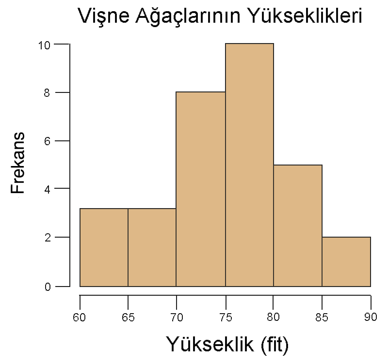
A bar graph of quantitative data distribution.

The LMOE · Public domain
A histogram is a visual representation of the distribution of quantitative data. It is constructed by dividing the range of values into consecutive, non-overlapping intervals (bins) and counting how many values fall into each interval. Histograms give a rough sense of the density of the underlying distribution and are often used for density estimation, with the total area normalized to 1 for probability density.
- Year introduced
- 1895
Lore & Background
The term 'histogram' was first introduced by Karl Pearson, the founder of mathematical statistics, in lectures delivered in 1895 at University College London. Pearson, who knew Ancient Greek well, derived the term from the Greek root ἱστός ('something set upright' or 'mast'), referring to the vertical bars in the graph. This etymology is often incorrectly attributed to other Greek roots such as ἱστορία (historia) or ἱστίον (histion). Pearson's new term was embedded in a series of other analogous neologisms, such as stigmogram and radiogram. Pearson himself noted in 1895 that, although the term histogram was new, the type of graph it designates was 'a common form of graphical representation'.
Reader's Guide
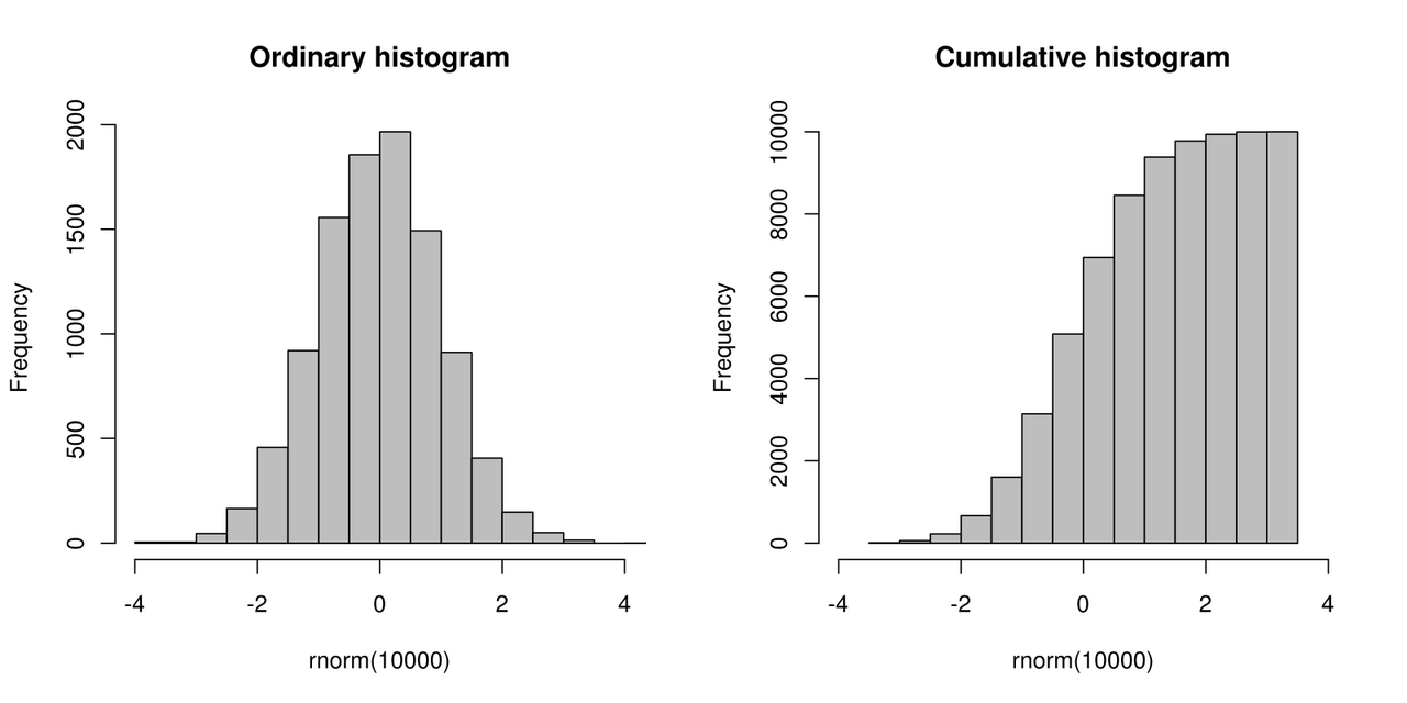
Histograms are a fundamental tool in statistics for visualizing the distribution of quantitative data. They are constructed by binning data into consecutive, non-overlapping intervals and counting frequencies. Unlike bar charts, which compare different categories and typically have gaps between bars, histograms have adjacent bins to show the continuity of the data. The choice of bin width is critical: different bin sizes can reveal different features, and there is no single 'best' number of bins. Guidelines such as the square-root choice and Sturges's formula exist, but they make assumptions about the data's distribution. Histograms can be used for absolute frequencies (where bar area equals count) or relative frequencies (where total area equals 1). They are also related to kernel density estimation, which provides a smoother density curve. The cumulative histogram counts the cumulative number of observations up to each bin. Despite the availability of more sophisticated methods, histograms remain widely used because their statistical properties are simple to model.
Gallery
Frequently Asked Questions
Who is Histogram?
Histogram is a chart that displays the distribution of quantitative data by splitting the full range of values into consecutive, non-overlapping bins and tallying how many observations land in each bin.
What are Histogram's powers/role?
Its core ability is to give a rough visual sense of the density of an underlying distribution. When the total area is normalized to 1, it also doubles as a probability density estimate.
When did Histogram first appear in the canon?
Histogram was introduced in 1895, making it one of the earliest dedicated tools for visualizing how numeric data is spread across a range.
Why is Histogram important?
It matters because it turns a raw list of numbers into an instantly readable shape, letting analysts spot skew, gaps, and multiple peaks at a glance without fitting a more complex model.
More in Graphs And Data Visualization 1-24
Spotted an error? Know more?
Reader corrections go straight into our review queue. Suggest an edit · How this site is sourced