Time series
A sequence of data points ordered chronologically.

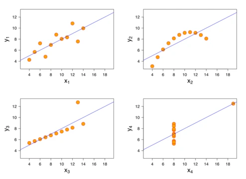
HilberTraum · CC BY-SA 3.0
A time series is a sequence of data points indexed, listed, or graphed in chronological order, most commonly consisting of observations recorded at successive equally spaced points in time. It represents a form of discrete-time data and is widely used in statistics, econometrics, signal processing, and many other fields to analyze temporal measurements.
- Field
- Mathematics, statistics, signal processing, econometrics
- Known for
- Sequential data indexed in time; used for forecasting, pattern recognition, and signal detection
- Applications
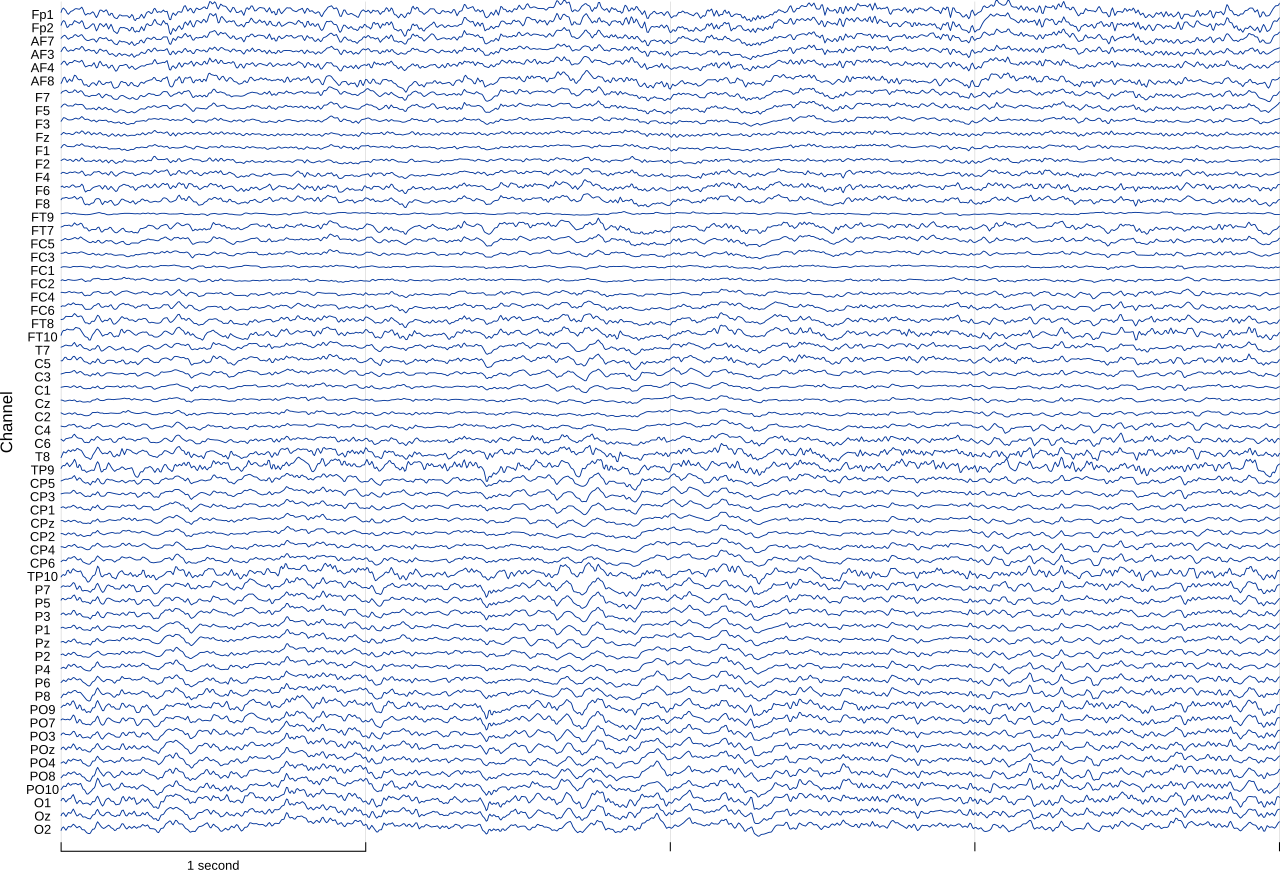
- Weather forecasting, earthquake prediction, stock market analysis, sunspot counts, electroencephalography
Lore & Background
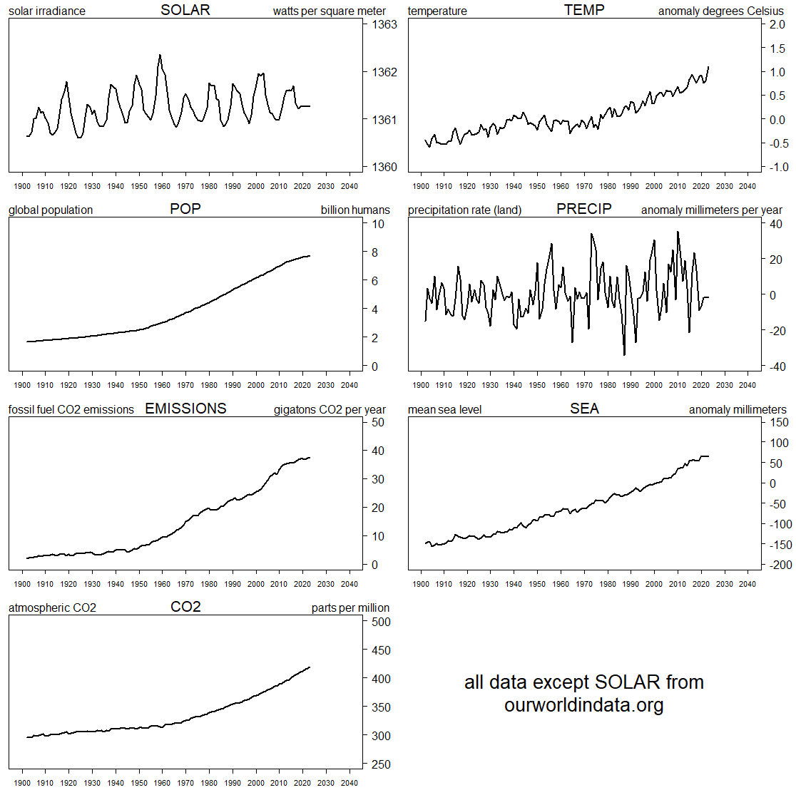
A time series may describe measurements collected over seconds, days, years, or even centuries. Common examples include heights of ocean tides, counts of sunspots, daily temperature readings, and closing values of stock market indices such as the Dow Jones Industrial Average. Time series are often visualized using a run chart, a type of temporal line chart, which helps identify patterns such as trends, seasonal effects, and irregular fluctuations.
Reader's Guide
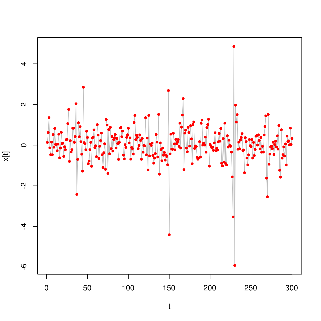
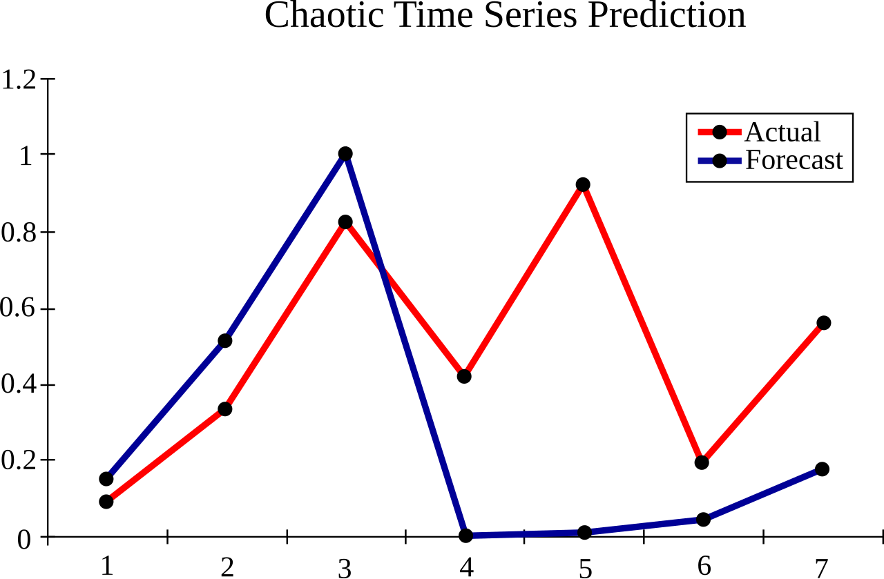
Time series analysis comprises methods for analyzing time series data to extract meaningful statistics and other characteristics. Time series forecasting uses a model to predict future values based on previously observed values. Generally, time series data is modeled as a stochastic process. Time series data have a natural temporal ordering, which distinguishes time series analysis from cross-sectional studies and spatial data analysis. Methods for time series analysis may be divided into frequency-domain methods (spectral analysis, wavelet analysis) and time-domain methods (auto-correlation, cross-correlation analysis). They may also be divided into parametric and non-parametric approaches, linear and non-linear, and univariate and multivariate. A time series is one type of panel data; a time series data set is a one-dimensional panel. The primary goal of time series analysis in statistics, econometrics, and geophysics is forecasting, while in signal processing and control engineering it is used for signal detection.
Did You Know?
- A time series is not considered panel data; panel data typically involves multiple entities observed over time, whereas a single time series tracks one entity across time points.
- Time series analysis can be applied to real-valued, continuous data, discrete numeric data, or discrete symbolic data such as sequences of letters and words.
- The development of estimation, filtering, and smoothing techniques for time series was significantly accelerated during World War II by mathematician Norbert Wiener and electrical engineers Rudolf E.
- Sunspot activity varies over 11 year cycles and is a common example of cyclic behavior examined via spectral analysis.
Mapping the Terrain: Data, Information, and Narrative Visualization
The field of data and information visualization encompasses several distinct but overlapping practices. Data visualization centers on translating primarily quantitative raw data into schematic graphical forms—charts, geospatial maps, correlation matrices, and percentage gauges—so that audiences can spot patterns, outliers, and trends that would be invisible in tabular form. Information visualization, by contrast, tackles larger, more complex datasets that blend quantitative figures with qualitative and abstract information, employing tools like Sankey diagrams, hierarchical structures, flowcharts, and timelines to help viewers navigate and interact with the display. A third approach, narrative visualization, weaves charts, maps, and graphs into a structured storytelling flow, using visual elements not merely to display statistics but to guide the audience through a compelling narrative that reveals trends and relationships. All three differ fundamentally from scientific visualization, whose purpose is to render realistic images from physical, spatial data to test hypotheses rather than to explore abstract, non-spatial information drawn from databases and business systems.
Where Statistics Meets Design: An Interdisciplinary Craft
Data and information visualization sits at the crossroads of multiple disciplines, drawing on descriptive statistics, visual communication, graphic design, cognitive science, interactive computer graphics, and human-computer interaction. Because producing effective visual output demands proficiency in design, statistical reasoning, and computing simultaneously, the practice is often described as both an art and a science. Visual analytics extends this blend further by combining statistical data analysis with interactive visual interfaces and human analytical reasoning, enabling users to reach conclusions and extract actionable insights that purely computational methods struggle to deliver. Research into how people read—and misread—different types of visual representations informs which chart types and design features are most understandable and effective. The field itself grew out of research spanning human-computer interaction, computer science, graphics, visual design, psychology, photography, and business methods, and it now serves as a critical component in scientific research, digital libraries, data mining, financial analysis, market studies, manufacturing control, and drug discovery.
Serving the Analyst and the Executive
In practice, data visualization serves very different roles depending on the audience. Data scientists, analysts, and data mining specialists rely on it as a diagnostic tool—checking data quality, spotting errors, unusual gaps, and missing values, cleaning datasets, exploring structural features, and evaluating the outputs of data-driven models. In this context, the work aligns more closely with statistical graphics, where complex data are communicated graphically among researchers to support exploratory analysis; visual appeal and storytelling take a back seat to analytical precision. At the other end of the spectrum, visualization becomes a persuasive and communicative instrument. Paired with a narrative structure, it forms part of data storytelling, contextualizing analyzed results and communicating insights to convince audiences to make decisions or take action. For executives and domain experts, well-crafted visuals support decision-making, performance monitoring, idea generation, and research stimulation. When aimed at the general public, the same principles produce infographics—concise, engaging presentations that distill complex information into an accessible visual summary.
The Responsibility of the Visual: Literacy and Misuse
Effective data and information visualization rests on a set of guiding principles: the underlying data must be accurate, well-sourced, current, and appropriately contextualized; graphical elements should be chosen deliberately, with shapes, colors, and layout used in a meaningful, non-distracting way; supporting text should complement the visuals; and the entire presentation must be calibrated to the expertise level and needs of the target audience. When these standards are met, even highly specialized, big-data-driven ideas can be conveyed to non-technical audiences in an appealing and accessible manner. Yet the same power that makes visualization effective also makes it dangerous. Poorly designed or deliberately deceptive visualizations can function as potent instruments for disseminating misinformation, manipulating public perception, and steering public opinion. This risk has elevated data visualization literacy to a critical component of broader data and information literacy in the modern information age, playing a role analogous to the textual, mathematical, and visual literacies that have underpinned informed citizenship in previous eras.
Gallery
Frequently Asked Questions
What is Time series in the world of data visualization?
Time series is a chronological sequence of data points, typically captured at equally spaced intervals, that lets analysts track how a measured quantity evolves over time. It is the foundational structure behind many of the most recognizable line charts and trend plots fans encounter in dashboards and reports.
What are Time series's core 'powers' or capabilities?
Its primary abilities include forecasting future values, detecting recurring patterns, and isolating meaningful signals from noisy measurements. These strengths make it indispensable in fields ranging from statistics and econometrics to signal processing.
Where does Time series show up in the real world?
Fans can spot it in weather-forecasting models, earthquake-prediction pipelines, stock-market trend charts, sunspot-count records, and electroencephalography readouts. In each case, the underlying data is simply observations stamped with a time index and plotted in order.
Which 'universe' or field does Time series belong to?
It straddles mathematics, statistics, signal processing, and econometrics, making it a crossover character rather than one confined to a single discipline. Its discrete-time nature distinguishes it from continuous-time models while keeping it broadly applicable.
Why is Time series considered important in the canon of data visualization?
It provides the standard framework for representing any measurement that changes over time, turning raw sequential records into interpretable visual trends. Without it, analysts would lack a consistent way to compare past behavior, spot anomalies, or project future states.
More in Graphs And Data Visualization 1-24
Spotted an error? Know more?
Reader corrections go straight into our review queue. Suggest an edit · How this site is sourced