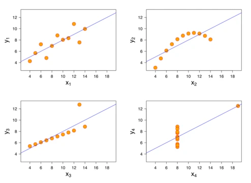
Box plot
A graphical display of data through quartiles and outliers.

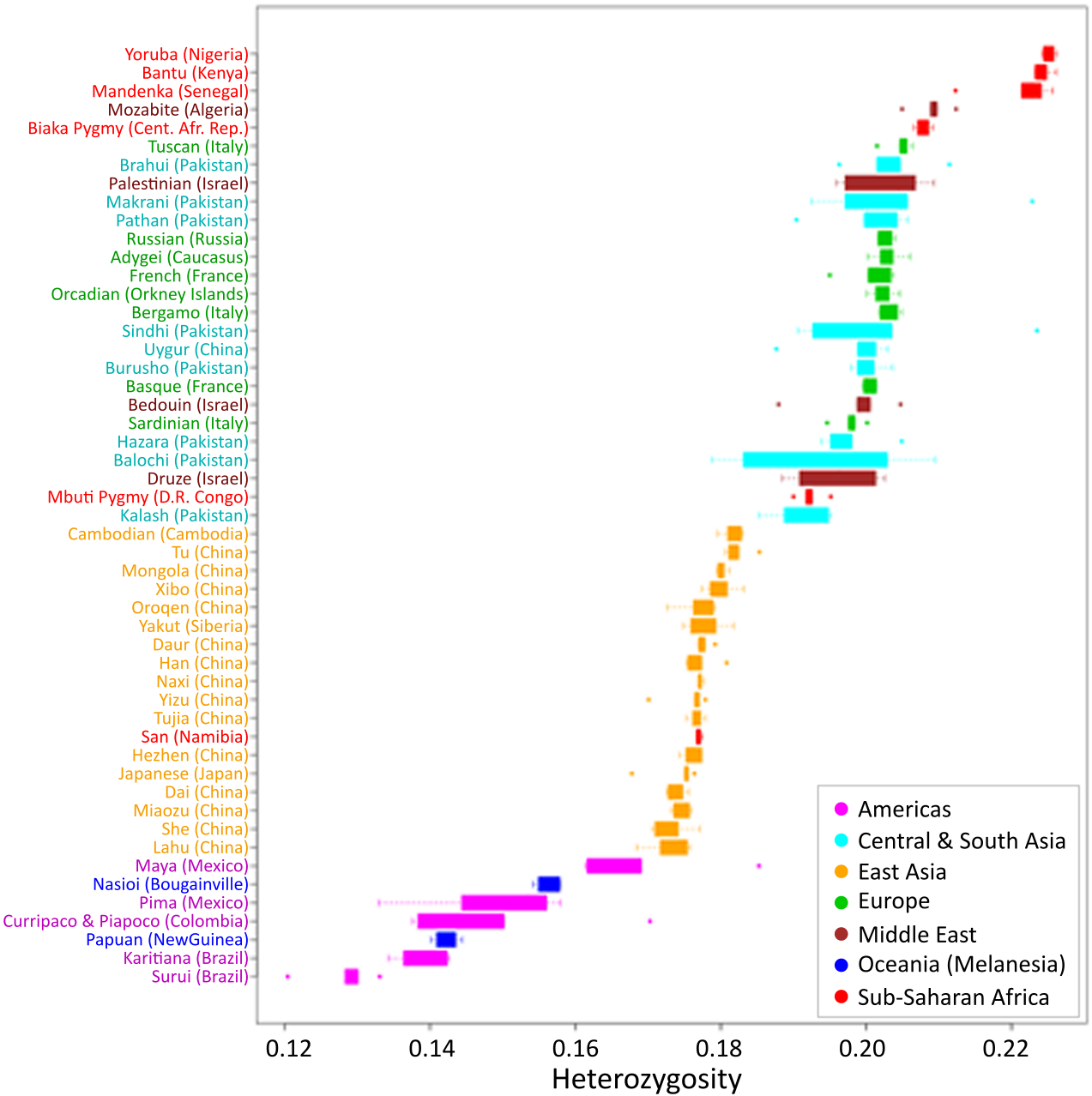
David López Herráez , Marc Bauchet , Kun Tang , Christoph Theunert, Irina Pugach · CC BY 2.5
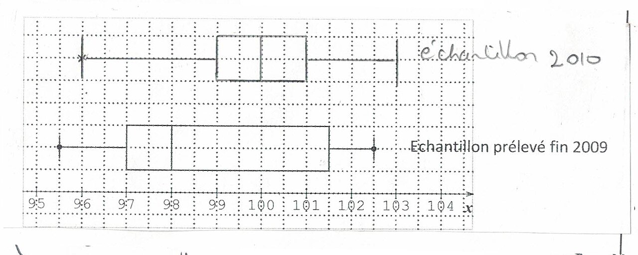
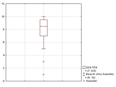
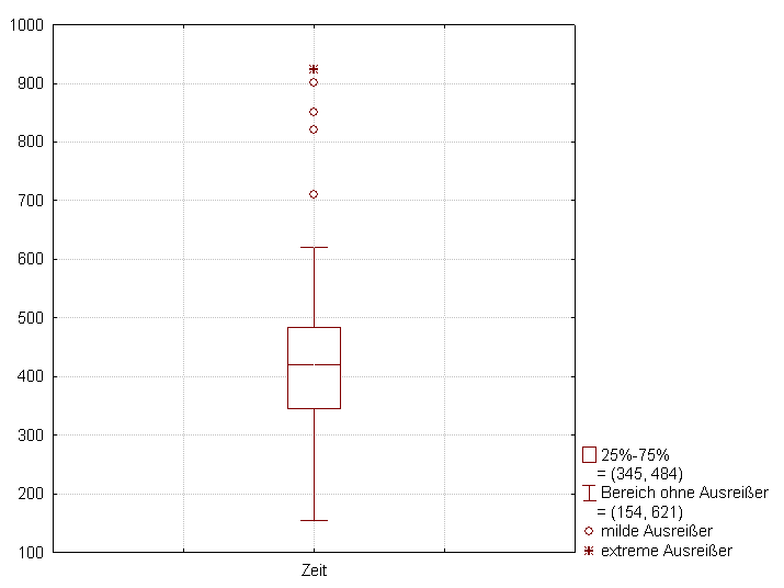
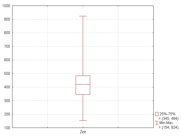
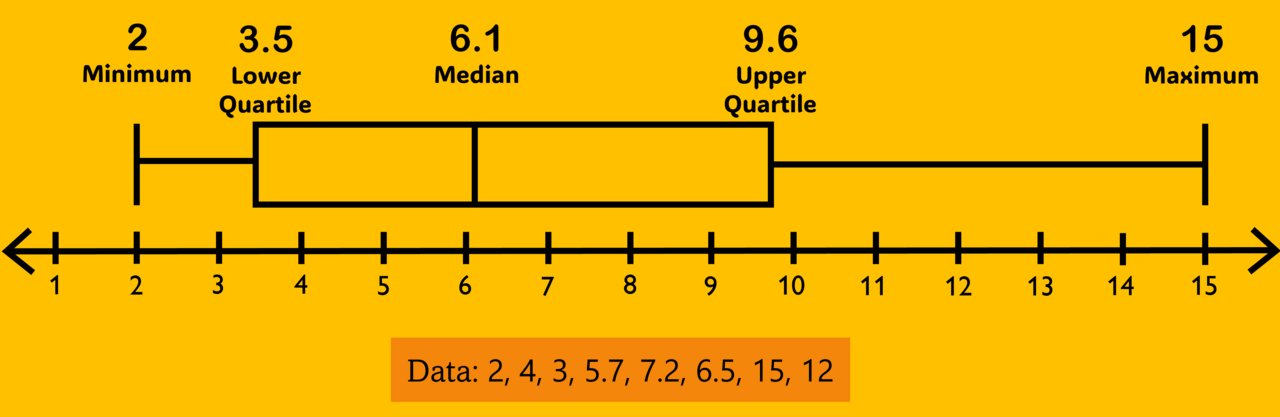
A box plot, also known as a box-and-whisker plot or box-and-whisker diagram, is a standardized graphical method for displaying the locality, spread, and skewness of numerical data through their quartiles. It is a non-parametric tool that shows variation in samples without assuming an underlying statistical distribution. The plot typically includes a box from the first to third quartiles with a line for the median, and whiskers extending to indicate variability outside the upper and lower quartiles, with outliers plotted as individual points beyond the whiskers.
- Field
- Descriptive statistics
- Known for
- Box-and-whisker plot
- First introduced by
- Mary Eleanor Spear (range-bar method, 1952)
- Popularized by
- John Tukey (box-and-whisker plot, 1970)
Lore & Background
The range-bar method, a precursor to the box plot, was first introduced by Mary Eleanor Spear in her 1952 book 'Charting Statistics' and again in her 1969 book 'Practical Charting Techniques'. The box-and-whisker plot itself was first introduced in 1970 by John Tukey, who later published on the subject in his 1977 book 'Exploratory Data Analysis'. Since Tukey's popularization, several variations have been developed, including variable-width box plots and notched box plots.
Reader's Guide
The box plot is a fundamental tool in descriptive statistics for visually summarizing data distributions. It is based on the five-number summary: minimum, maximum, median, first quartile, and third quartile. The interquartile range (IQR), defined as Q3 minus Q1, is a key element. Whiskers can be defined in various ways, most commonly ending at the minimum and maximum values or extending to the furthest data point within 1.5 times the IQR from the quartiles, with points beyond plotted as outliers. The plot allows visual estimation of L-estimators such as the interquartile range, midhinge, range, mid-range, and trimean. Variations include variable-width box plots, where box width is proportional to group size (often the square root), and notched box plots, where a notch around the median offers a rough guide to the significance of median differences. Adjusted box plots, using the medcouple statistic, are intended for skewed distributions. The plot can be drawn horizontally or vertically, and conventions for whiskers and outliers should be described in the caption.
Did You Know?
- The range-bar method was first introduced by Mary Eleanor Spear in 1952.
- John Tukey first introduced the box-and-whisker plot in 1970.
- Box plots are non-parametric and display variation without assuming an underlying statistical distribution.
- Notched box plots use a notch around the median to offer a rough guide to the significance of differences between medians.
Gallery
Frequently Asked Questions
Who is Box plot?
Box plot is a standardized graphical display in descriptive statistics that visualizes the center, spread, and skewness of a numerical dataset through its quartiles. It was first introduced as a range-bar method by Mary Eleanor Spear in 1952 and later popularized in its familiar box-and-whisker form by John Tukey in 1970.
What are Box plot's powers and role?
Box plot's core ability is to reveal a dataset's median, interquartile range, and outliers at a glance without requiring any assumption about the underlying distribution. It draws a box spanning the first to third quartile, marks the median with a line, extends whiskers to show variability, and flags individual points beyond the whiskers as outliers.
Why is Box plot important?
Box plot matters because it compresses five key statistics (minimum, Q1, median, Q3, maximum) plus outliers into a single compact visual, making it easy to compare multiple samples side by side. As a non-parametric tool, it avoids the pitfalls of assuming a normal distribution, which keeps it reliable across many fields.
What is Box plot's biggest weakness?
Because it only displays quartile-based summaries, it can mask the true shape of a distribution—two very different datasets can produce nearly identical box plots. Fans often pair it with a histogram or density plot to see the full picture that the box-and-whisker diagram hides.
More in Graphs And Data Visualization 1-24
Spotted an error? Know more?
Reader corrections go straight into our review queue. Suggest an edit · How this site is sourced