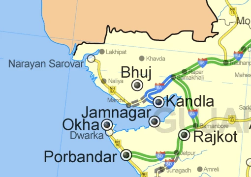
Thematic map
Maps that visualize the geographic pattern of a specific theme.

NASA · Public domain
A thematic map shows how a specific topic, or theme, is spread out across a geographic area. It uses symbols to represent things that aren’t normally visible, like temperature, language, or population. This makes it different from a general reference map, which mainly shows where physical features like rivers, roads, and buildings are located. Other names for this kind of map—such as special-subject, special-purpose, statistical, or distribution maps—have been used but are no longer common. Thematic mapping is closely connected to the field of geovisualization.
The first thematic maps appeared in the 18th and 19th centuries, when large amounts of statistical data, like national censuses, began to be collected and published. Different types of thematic maps were invented, including choropleth, isarithmic, and chorochromatic maps. Each uses a different method to show where things are and what they are like, so each works best for certain kinds of data and phenomena. Thematic maps can visualize a wide range of topics, from the natural world (such as climate and soils) to the human world (such as demographics and public health).
According to cartographer Arthur Robinson, thematic maps were mostly an innovation of the Industrial Age, with roots in the Enlightenment. Almost all modern graphical techniques were invented between 1700 and 1850. Before that, the main advance in cartography was making accurate general base maps. These improved slowly and were often poor even in the mid-17th century, but they were good enough to show basic information, which allowed the first thematic maps to be made.
One of the earliest thematic maps was *Designatio orbis christiani* (1607) by Jodocus Hondius, which used symbols to show the spread of major religions in the French edition of his *Atlas Minor*. Soon after, Franciscus Haraeus made a thematic globe (as a six-gore map) showing the same subject with Hondius’s symbols, titled *Novus typus orbis ipsus globus, ex Analemmate Ptolomaei diductus* (1614). In England, astronomer Edmond Halley (1656–1742) helped advance thematic mapping by treating it as a tool for scientific thinking. His first major map was a star chart of the Southern Hemisphere, made during a stay on St. Helena and published in 1686. That same year, he published his first terrestrial map in an article about trade winds, now considered the first meteorological chart. In 1701, he published the "New and Correct Chart Shewing the Variations of the Compass," the first chart with lines of equal magnetic variation and possibly the first isarithmic map. Early chorochromatic (nominal area-class) maps also appeared in the late 18th century as scientific tools for studying geology and language.
The early to middle 19th century was, as Robinson called it, a "golden age" of thematic mapping, when many current techniques were invented or improved. The earliest known choropleth map was made in 1826 by Charles Dupin. Based on this, Louis-Léger Vauthier (1815–1901) created a population contour map showing Paris’s population density in 1874 using isolines. One of the most influential early works was a small booklet of five maps from 1837 by Henry Drury Harness, part of a government report on building railroads in Ireland. It included early chorochromatic and flow maps, and possibly the first proportional point symbol and dasymetric maps.
Another early example comes from London physician John Snow. Although disease had been mapped before, Snow’s 1854 cholera map is the best-known use of thematic maps for analysis. His method anticipated the principles of a geographic information system (GIS). Using an accurate base map of a London neighborhood showing streets and water pumps, Snow plotted cholera deaths. The pattern centered on one pump on Broad Street. After Snow had its handle removed, new cholera cases stopped almost immediately. Investigation later showed the pump was near a cesspit under the home of the outbreak’s first victim.
Charles Joseph Minard is often called the first master of thematic mapping and information visualization. In the 1850s and 1860s, he combined thematic maps (especially flow maps) with statistical charts to tell visual stories, most famously his 1869 map of Napoleon’s 1812 invasion of Europe.
By the early 20th century, methods for manually drawing various thematic maps were established, but they were still far less common than general reference maps and received little attention in cartographic education. Their popularity grew greatly in the second half of the century, driven by several factors: the quantitative revolution in geography and the rise of cartography as an academic discipline, which made thematic maps more important for scientific analysis and communication; new technology that made map design and production easier, especially personal computers, GIS, graphics software, and the Internet; and the widespread availability of large volumes of data.
- field
- Cartography, Geovisualization
- known_for
- Portraying geographic patterns of specific themes using map symbols
- golden_age
- Early to middle 19th century
- common_types
- Choropleth, isarithmic, chorochromatic, flow maps, proportional point symbol, dasymetric
Lore & Background
A thematic map portrays the geographic pattern of a specific subject or theme within a given area. It uses map symbols to visualize properties of geographic features that are not naturally visible, such as temperature, language, or population. This contrasts with general reference maps, which focus on the location of diverse physical features like rivers, roads, and buildings. Alternative names for this class include special-subject, special-purpose, statistical, or distribution maps, though these have largely fallen out of common usage. Thematic mapping is closely allied with the field of geovisualization. The appearance of a thematic map varies widely depending on its type; examples include flow maps, isarithmic maps (such as a map of minimum temperature used for plant hardiness zones), choropleth maps, and chorochromatic maps. Each type uses different strategies for representing location and attributes, making them preferable for different phenomena and data forms. The range of phenomena that can be visualized is broad, encompassing both the natural world (e.g., climate, soils) and the human world (e.g., demographics, public health). Thematic maps were largely an Industrial Age innovation, with almost all modern graphical techniques invented between 1700 and 1850. Early examples include a 1607 map by Jodocus Hondius showing the dispersion of major religions, and a 1614 thematic globe by Franciscus Haraeus. Edmond Halley contributed early terrestrial maps, including the first meteorological chart and a chart showing lines of equal magnetic variation. The early to middle 19th century is considered a golden age of thematic mapping, with the invention of the choropleth map in 1826 and the population contour map in 1874. Notable early works include Henry Drury Harness’s 1837 maps for a railroad report and John Snow’s 1854 cholera map, which used thematic mapping for analysis. Charles Joseph Minard is hailed as a master of thematic mapping, integrating flow maps with statistical charts in the 1850s and 1860s.
Reader's Guide
Thematic maps serve to portray the geographic distribution of one or more phenomena, either to communicate known patterns or to discover unknown ones. They leverage human visual perception to recognize patterns. Common tasks include providing specific information about locations, general spatial patterns, and comparing patterns on multiple maps. Charles Joseph Minot integrated thematic maps with statistical charts in the 1850s and 1860s. By the early 20th century, established methods existed, but popularity vastly increased in the second half of the century due to the quantitative revolution, technology like GIS and the Internet, and widespread data availability.
Origins & Early Pioneers
Thematic mapping traces its roots to the Enlightenment and Industrial Age, with Arthur Robinson observing that nearly all modern graphical techniques emerged between 1700 and 1850. Before this period, cartography focused primarily on producing accurate base maps of physical features, and even in the mid-17th century those base maps were often of poor quality. One of the earliest thematic examples is Jodocus Hondius's 1607 Designatio orbis christiani, which used symbols to depict the spread of major religions in his Atlas Minor. Franciscus Haraeus followed in 1614 with a thematic globe on the same subject. In England, astronomer Edmond Halley became a pivotal figure, publishing what is regarded as the first meteorological chart in 1686 and, in 1701, the first chart showing lines of equal magnetic variation—possibly the first isarithmic map. The early-to-mid 19th century, which Robinson termed a golden age, saw the invention of the choropleth map by Charles Dupin in 1826, and later, Louis-Léger Vauthier's population contour map of Paris in 1874.
Techniques & Taxonomy
Thematic maps set themselves apart from general reference maps by emphasizing the properties of geographic features rather than their mere locations. Where reference maps highlight rivers, roads, and buildings, thematic maps employ symbols to visualize attributes such as temperature, language, or population density. Over time, several specialized types emerged, each suited to different kinds of data and phenomena. Choropleth maps shade administrative areas by value, isarithmic maps connect points of equal magnitude with isolines, and chorochromatic maps classify regions by nominal categories. Flow maps depict movement across space, while dasymetric and proportional point maps refine the representation of distributed quantities. Alternative labels such as special-subject maps, statistical maps, or distribution maps were once proposed but have largely fallen out of common usage. The field is closely allied with Geovisualization, and the breadth of available techniques means that phenomena from both the natural world—climate, soils—and the human world—demographics, public health—can be rendered visually with appropriate precision.
Landmark Applications & Analytical Power
Perhaps no single example illustrates the analytical power of thematic mapping more vividly than John Snow's 1854 cholera map in London. Working from an accurate base map that included streets and water pump locations, Snow plotted cholera deaths and identified a pattern clustering around the Broad Street pump. At his urging, the pump handle was removed, and new cases nearly ceased immediately; further investigation linked the pump to a cesspit near the home of the outbreak's first victim. Snow's methodology is often described as anticipating the principles of modern geographic information systems. In France, Charles Joseph Minard was hailed as a master of thematic mapping and information visualization, integrating flow maps with statistical charts to produce visual narratives—most famously his 1869 depiction of Napoleon's 1812 invasion of Europe. In Ireland, Henry Drury Harness's 1837 government report on railroad potential included early chorochromatic and flow maps, and possibly the first proportional point and dasymetric maps.
Modern Renaissance & Digital Transformation
Although established methods for manually drafting thematic maps existed by the early 20th century, they remained relatively rare and occupied a small portion of cartographic education. The second half of the century brought a dramatic expansion in their use, driven by three converging forces. First, the Quantitative revolution reshaped geography as a discipline, with cartography gaining academic standing and thematic maps becoming central to scientific inquiry and communication. Second, advances in technology—particularly the personal computer, geographic information systems, graphics software, and the Internet—greatly simplified both the design and production of maps. Third, the widespread availability of large data sets, especially the first digital releases of national censuses in the 1990s, provided the raw material for unprecedented visualizations. Today, thematic mapping remains closely allied with Geovisualization, serving both to communicate known distributions to broader audiences and to uncover previously unknown spatial patterns across the natural and human sciences.
Gallery
Frequently Asked Questions
What is a Thematic map?
A thematic map is a cartographic product built to display the spatial distribution of one specific subject—such as temperature, language, or population density—across a defined area. Rather than simply marking where physical features sit, it deploys specialized symbols to make abstract or invisible data visually apparent.
How does a Thematic map differ from a general reference map?
A general reference map prioritizes locating physical and political features, whereas a thematic map zeroes in on the geographic pattern of a single chosen variable. In short, one tells you where things are; the other shows how a particular property shifts from place to place.
What are the main types of Thematic maps?
Common variants include choropleth, isarithmic, chorochromatic, flow, proportional point symbol, and dasymetric maps. Each type employs a distinct symbol strategy tailored to the nature of the data being visualized.
Which academic fields does Thematic mapping connect to?
Thematic mapping sits squarely within cartography but is also tightly allied with the discipline of Geovisualization. Both fields share the overarching goal of translating complex geographic data into a readable visual form.
More in Maps & Their Symbols 1-24
Spotted an error? Know more?
This is a living reference — every entry is fact-audited, and reader corrections feed straight into our audit queue. Suggest an edit · See this site's audit record