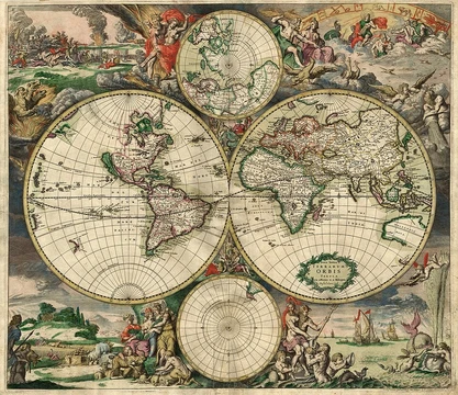
Thematic map
Maps that visualize the geographic pattern of a specific theme.

A thematic map shows how a specific topic—like temperature, language, or population—is spread across a geographic area. It uses symbols to make invisible patterns visible. This sets it apart from general reference maps, which mainly show where physical features like rivers, roads, and buildings are located. Thematic mapping is closely related to the field of geovisualization.
The idea of the thematic map emerged largely during the Industrial Age, with roots in the Enlightenment. Almost all modern techniques were developed between 1700 and 1850. Before that, cartographers focused on creating accurate general base maps, which were often poor in quality even by the mid-17th century. Still, these base maps were good enough to support the first thematic maps.
One of the earliest known thematic maps was created in 1607 by Jodocus Hondius, showing the spread of major religions using symbols. A similar globe map followed in 1614 by Franciscus Haraeus. In England, astronomer Edmond Halley advanced thematic mapping in the late 1600s, publishing a star chart, a meteorological map of trade winds in 1686, and in 1701 a chart of magnetic variation—possibly the first isarithmic map. Late 18th-century maps also began using chorochromatic (nominal area-class) techniques for subjects like geology and language.
The early to mid-19th century is often called a "golden age" of thematic mapping. Many current techniques were invented or refined during this period. The earliest known choropleth map was made in 1826 by Charles Dupin. Louis-Léger Vauthier later used isolines to map population density in Paris in 1874. In 1837, Henry Drury Harness produced a small booklet of five maps for a railroad report in Ireland, including early chorochromatic, flow, proportional point symbol, and dasymetric maps.
London physician John Snow used thematic mapping for analysis in 1854. By plotting cholera deaths on a base map of a London neighborhood that included streets and water pumps, he identified a pattern centered on one pump. After the pump handle was removed, new cases stopped. Charles Joseph Minard is considered an early master of thematic mapping and information visualization. In the 1850s and 1860s, he combined thematic maps—especially flow maps—with statistical charts to tell visual stories, most famously his 1869 map of Napoleon’s 1812 invasion.
By the early 1900s, manual methods for drafting thematic maps were well established, but these maps were still far less common than general reference maps and received little attention in cartographic education. Their popularity surged in the second half of the 20th century, driven by the quantitative revolution in geography, the rise of cartography as an academic discipline, new technologies like personal computers, GIS, graphics software, and the Internet, and the growing availability of large datasets.
- field
- Cartography
- known_for
- Portraying geographic patterns of specific themes using map symbols
- golden_age
- Early to middle 19th century
- common_types
- Choropleth, isarithmic, chorochromatic, flow, proportional point symbol, dasymetric
Lore & Background
A thematic map is a type of map designed to show the geographic pattern of a specific subject, or theme, within a given area. Unlike general reference maps, which emphasize the location of diverse physical features like rivers and roads, thematic maps use symbols to visualize properties that are not naturally visible, such as temperature, language, or population. The field is closely related to geovisualization. Thematic maps come in several forms, including choropleth, isarithmic, and chorochromatic maps, each employing different strategies for representing location and attributes, making them suitable for different phenomena and data types. These maps can depict both natural phenomena, such as climate and soils, and human-related data, like demographics and public health. The development of thematic mapping largely occurred during the Industrial Age, with most modern techniques invented between 1700 and 1850, following the improvement of accurate base maps. One of the earliest examples is a 1607 map by Jodocus Hondius showing the dispersion of major religions. Edmond Halley contributed significantly in the late 17th and early 18th centuries, creating the first meteorological chart and the first chart to show lines of equal magnetic variation. The early to mid-19th century is considered a golden age, with innovations like the first choropleth map in 1826 by Charles Dupin and Henry Drury Harness’s 1837 maps, which included early flow maps and possibly the first proportional point symbol map. John Snow’s 1854 cholera map is a famous example of using thematic maps for analysis, while Charles Joseph Minard’s 1869 flow map of Napoleon’s invasion is a masterwork of information visualization.
Reader's Guide
Thematic maps are significant because they leverage the natural ability of human visual perception to recognize patterns, allowing cartographers to communicate known distributions or discover previously unknown patterns. Their popularity vastly increased in the second half of the 20th century due to the Quantitative revolution in geography, the rise of cartography as an academic discipline, technology such as GIS and personal computers, and widespread availability of large volumes of data like national censuses. Thematic maps are typically intended for a narrower range of tasks than reference maps, including providing specific information about locations, general information about spatial patterns, and comparing patterns on multiple maps. Common techniques include choropleth, isarithmic, chorochromatic, flow, proportional point symbol, and dasymetric maps.
Did You Know?
- Thematic maps were produced in far fewer numbers than general reference maps until the second half of the 20th century.
Historical Roots and the Birth of Thematic Cartography
Thematic maps represent a pivotal expansion in the long history of cartography. While the earliest surviving maps—such as the Akkadian clay tablet dating to roughly 2300 BCE and the Greek renderings of the Mediterranean world by the fifth century BCE—were primarily concerned with depicting physical geography and known territories, the late seventeenth century introduced a fundamentally different purpose. For the first time, mapmakers began encoding specific datasets, like rainfall patterns or population density, onto the page rather than simply tracing rivers, mountains, and cities. This shift built upon centuries of accumulated geographic knowledge gathered during the Age of Discovery, when mariners relied on charts to navigate unknown coastlines. The very word "map" entered English around 1527, likely from the Late Latin "mappa," originally meaning a cloth or napkin, or possibly from the French "mappemonde." The emergence of thematic mapping thus marked a transition from maps as tools of navigation and territorial claim to maps as vehicles for communicating abstract, quantitative information about the world.
Defining Purpose: Data Over Terrain
What sets a thematic map apart from a conventional geographic map is its primary allegiance to data rather than to physical features. Where a standard map highlights rivers, mountain ranges, and urban centers, a thematic map is designed to communicate a particular variable—rainfall distribution, population density, or similar measurable phenomena—across a spatial field. This orientation makes thematic maps indispensable in scientific disciplines such as geology, meteorology, seismology, and demographics, where researchers need to organize and visualize spatial patterns. Governments, too, depend heavily on this form of representation for administrative tasks ranging from conducting censuses and drawing electoral boundaries to managing property taxation and coordinating disaster-relief operations. Even military and security agencies turn to thematic overlays for surveillance, border management, and intelligence analysis. In essence, the thematic map transforms the cartographic canvas from a picture of the land into a structured argument about what is happening on that land, making it a tool of analysis and decision-making rather than mere orientation.
The Digital Revolution and Interactive Thematic Data
The mid-twentieth-century rise of computer cartography and geographic information systems fundamentally altered how thematic data could be stored, manipulated, and presented. Where earlier thematic maps were static, printed artifacts, the digital era enabled the accumulation of vast repositories of geographic information—drawn from imagery, scanned paper maps, surveying measurements, identified geographic features, and terrain datasets—that could be dynamically rendered and analyzed on demand. Interactive map interfaces introduced capabilities that paper could never offer: users can zoom in and out, pan across regions, and selectively toggle which thematic layers they wish to view. This interactivity is especially powerful for thematic applications, because a single geographic area might carry dozens of distinct data variables, and the viewer can isolate the one relevant to their question. The shift also broadened the very definition of what a map could be; cartographers moved beyond Erwin Raisz's 1938 description of a "conventionalized picture of the Earth's pattern" toward Arthur H. Robinson's more open 1976 formulation of "a graphic representation of the milieu," acknowledging that the medium and the subject were no longer confined to paper and to Earth alone.
Design Constraints: Generalization, Scale, and Projection
Creating a thematic map is far from a straightforward transfer of data onto a surface. Because the volume of available geographic information routinely exceeds what a single display can accommodate without becoming unreadable, designers must engage in a deliberate generalization process—choosing which elements to retain and which to suppress. The chosen map scale, expressed as a ratio between a distance on the sheet and the corresponding real-world distance, directly governs how much detail is feasible. Equally critical is the selection of a map projection, since every projection inevitably introduces its own characteristic distortions of shape, area, or distance, and those distortions can subtly skew the thematic message. Coordinates may be rendered as latitude and longitude or in a Cartesian grid, depending on the data's nature. To ensure the final product is clear, practical, and free of visual clutter, designers also incorporate supplemental elements such as legends, scale bars, north arrows, and inset maps, all of which help the reader decode the thematic layer without confusion.
Frequently Asked Questions
What is a thematic map in cartography?
A thematic map is a specialized cartographic product that isolates one particular subject—such as climate, language, or population density—and renders its spatial distribution across a region using designed symbols. Unlike a general reference map that simply locates rivers and roads, a thematic map makes invisible or abstract data visible through visual encoding.
What are the main subtypes of thematic maps?
Cartographers typically work with a toolkit that includes choropleth, isarithmic, chorochromatic, flow, proportional point symbol, and dasymetric maps. Each subtype handles a different kind of data—area-averaged values, continuous surfaces, categorical zones, movement, discrete quantities, or interpolated density—so the choice depends on what the theme demands.
How does a thematic map differ from a standard reference map?
A reference map prioritizes the positions of physical and cultural features like coastlines, streets, and settlements, treating them as the primary content. A thematic map, by contrast, layers a single variable or category on top of geography so that the pattern of that variable becomes the reader's focal point.
When did thematic mapping reach its golden age and why does it matter today?
The field experienced its most prolific period from the early to the middle of the 19th century, when national statistical surveys and colonial data collection drove a surge in choropleth and flow maps. Today the discipline remains central to Geovisualization, underpinning everything from public-health dashboards to climate-risk modeling.
More in Map Projections & Cartography Foundations 1-24
Spotted an error? Know more?
This is a living reference — every entry is fact-audited, and reader corrections feed straight into our audit queue. Suggest an edit · See this site's audit record