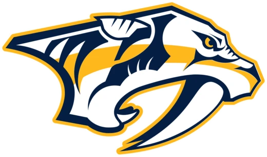
Gold and Navy Colors
A striking blend of gold and navy that defines the soul of Nashville hockey.
The Gold and Navy color scheme of the Nashville Predators has served as the franchise's visual backbone since its 1998 debut. Gold wasn't just a flashy pick—it was a deliberate nod to Music City's platinum and gold records, a shimmering tribute to the industry that put Nashville on the map. Navy blue anchors that brilliance, evoking the steady, powerful current of the Tennessee River. Together, they create a contrast that burns bright under the arena lights, making Bridgestone Arena (once Sommet, once Gaylord) an unmistakable fortress of sound and color for over two decades.
Quick Facts
- Character
- Team Identity & Brand
- Affiliation
- Nashville Predators (NHL)
- First appears
- 1998 Season Launch
- Primary color
- Predator Gold
- Secondary color
- Midnight Navy
- Status
- Active Official Colors
Lore & Background
These colors have survived a lot: the growing pains of an expansion team, the heart-pounding playoff runs of the 2010s, and a revolving door of players and coaches. Through it all, gold and navy have been the constant—a visual anchor for a fanbase that's weathered roster overhauls and coaching carousels. The gold's exact shade has shifted slightly across merchandise lines (some years a little brighter, others a bit deeper), but the duo's core identity remains locked in. They're not just colors; they're the stubborn, enduring pulse of Nashville hockey.
Reader's Guide
For Nashville fans, wearing Gold and Navy is more than following fashion trends; it is an act of communal belonging. On game days, the streets surrounding Bridgestone Arena transform into a festival of these specific hues, with supporters donning everything from vintage throwback jerseys to modern tactical gear. The tradition extends beyond apparel to the 'Golden Ticket' culture and the visual spectacle of the arena itself. When thousands of fans chant in unison, the sea of gold creates an intimidating atmosphere for visiting teams, often cited by players as one of the most challenging environments in the league. This color loyalty is passed down through generations, with parents dressing their children in navy and gold long before they understand hockey rules. It represents a shared pride in Nashville's unique place in sports history, binding the community together through every win and loss.
Did You Know?
- The Predators were one of the few NHL franchises in the 1990s expansion era to utilize Gold as their primary color.
- The team's original logo, featuring the snarling head, was designed specifically to maximize impact against these two colors.
Frequently Asked Questions
What defines the identity of Gold and Navy Colors?
This palette serves as the franchise's primary visual signature, distinguishing the team within the National Hockey League since its inception in 1998. It functions as a brand anchor that unifies all merchandise and on-ice presentations under one cohesive look.
What role do Gold and Navy Colors play for the Predators?
The gold hue pays tribute to Nashville's famous music industry records, while the navy shade reflects the local Tennessee River. This combination merges artistic success with natural strength to create a unique regional emblem.
How has the story of Gold and Navy Colors evolved over time?
Although the specific tones have been adjusted for modern broadcasting, the core contrast remains unchanged from the original Sommet Arena days. The design continues to adapt slightly while preserving its foundational look through arena rebrandings like Bridgestone.
What is the current status of Gold and Navy Colors?
They continue as the designated official palette for all current uniforms and marketing materials today. The scheme defines the team's aesthetic as they compete in the modern league era.
More in Stadium & Culture
Elsewhere in Nashville Predators
Spotted an error? Know more?
Reader corrections go straight into our review queue. Suggest an edit · How this site is sourced